Notion
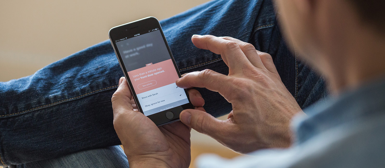
Notion offers a non-invasive, home monitoring system that proactively runs in the background and keeps an eye on your home when you’re not there, so that you can get out and live life. This is a case study behind the creation of the app.

—
Challenge
How do you take a physical and digital technology product system and invisibly integrate it into your home while still reducing anxiety around home problems?
Mindset - Insight
In a world full of buzz and surface interactions, people are seeking more depth and meaning. They are craving time away from the stimulus of the internet, making their leisure time more about self-development, and taking their own ethical responsibilities seriously.
—
Research outline
LARGE AUDIENCES
Surveys
Typeform surveys sent out to email newsletter to help evaluate experiences for focus.
App Analytics
Using analytics to spot pain points and feature usage stats
Customer Support
One-off feedback (email) categorized by problem and location in app.
1-ON-1 TESTING
Screeners
A list of logic based questions determining if participant is good candidate.
Remote Testing
UserTesting offers a great screener + audience.
Observational Testing
Local beta testers available during work hours and to come into office for observation.
SYNTHESIS
Need / Want Framework
Help find patterns within qualitative data
Rainbow Spreadsheet
Great for finding patterns across multiple participants in observational testing.

—
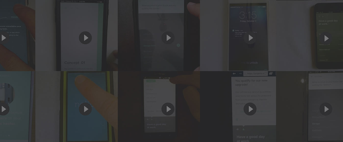
Notes on Process
Release Hills
Before any design began, we spent a good amount of time sifting through all of the currently slated features and weighed them alongside the insights generated from user research. The resulting list of capabilities then was narrowed again by those that were uniquely defensible by Notion in the growing smart home market.
Job Stories
To eliminate feature bloat we used job stories, based on the ongoing user research being conducted, versus traditional user stories. The structure of a job story sheds personas in favor of situational awareness. This helps keep the product team honest when discussing possible new features and their inherent worth to the overall experience.
Design ♡ Development
At Notion we had both software and hardware development happening in tandem. This required weekly scoping of new work and healthy discussions around technical contraints. I attribute much of the innovative work we created as a team happened as a result of this close-knit work style.
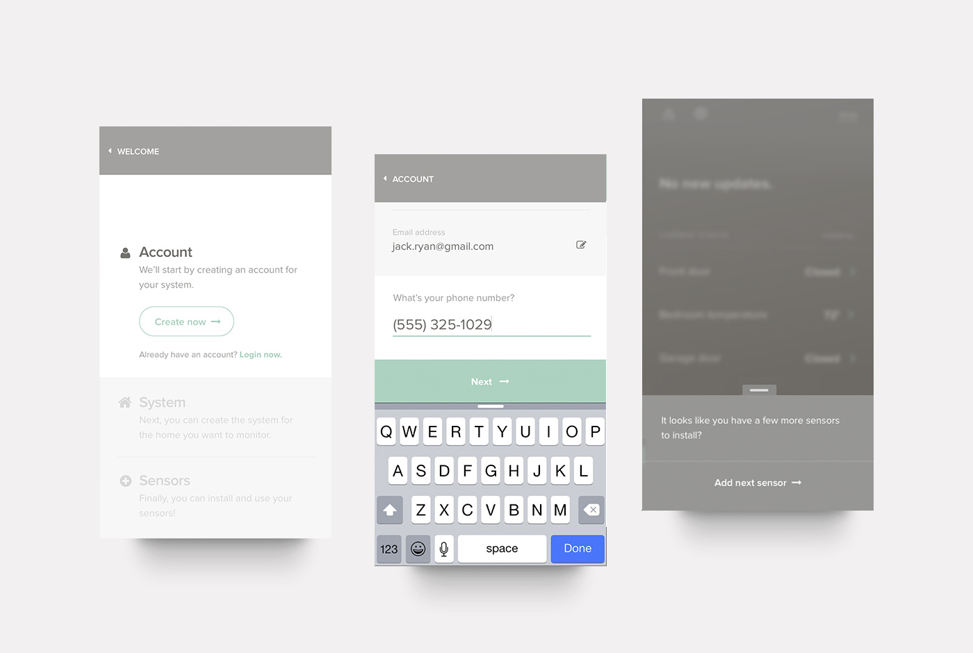
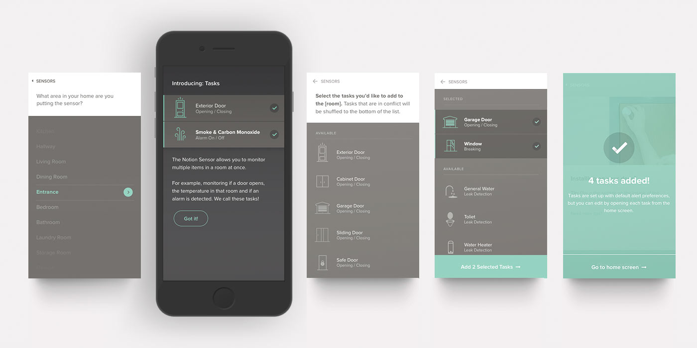
Release Hill #1 - Install
A feeling of success minutes after opening the app.

—
Introducing: Tasks
To help educate our users about Notion's ability to monitor multiple things at once, we created 'tasks'. By splitting out function from the the sensors themselves, we were able to enable a more flexible system.



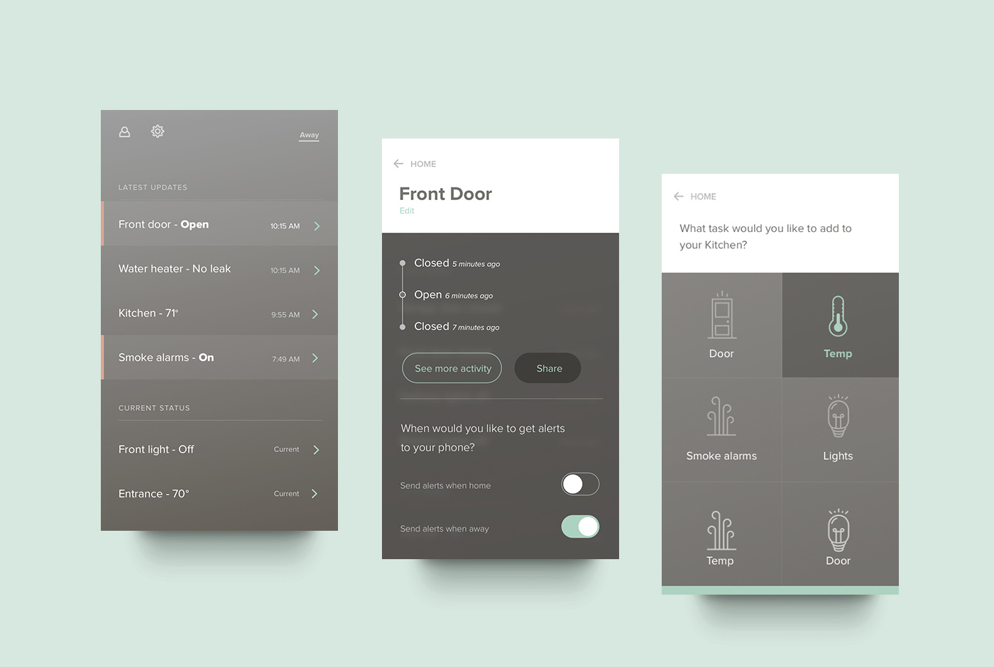
Release Hill #2 - Status
Know your home at a glance.

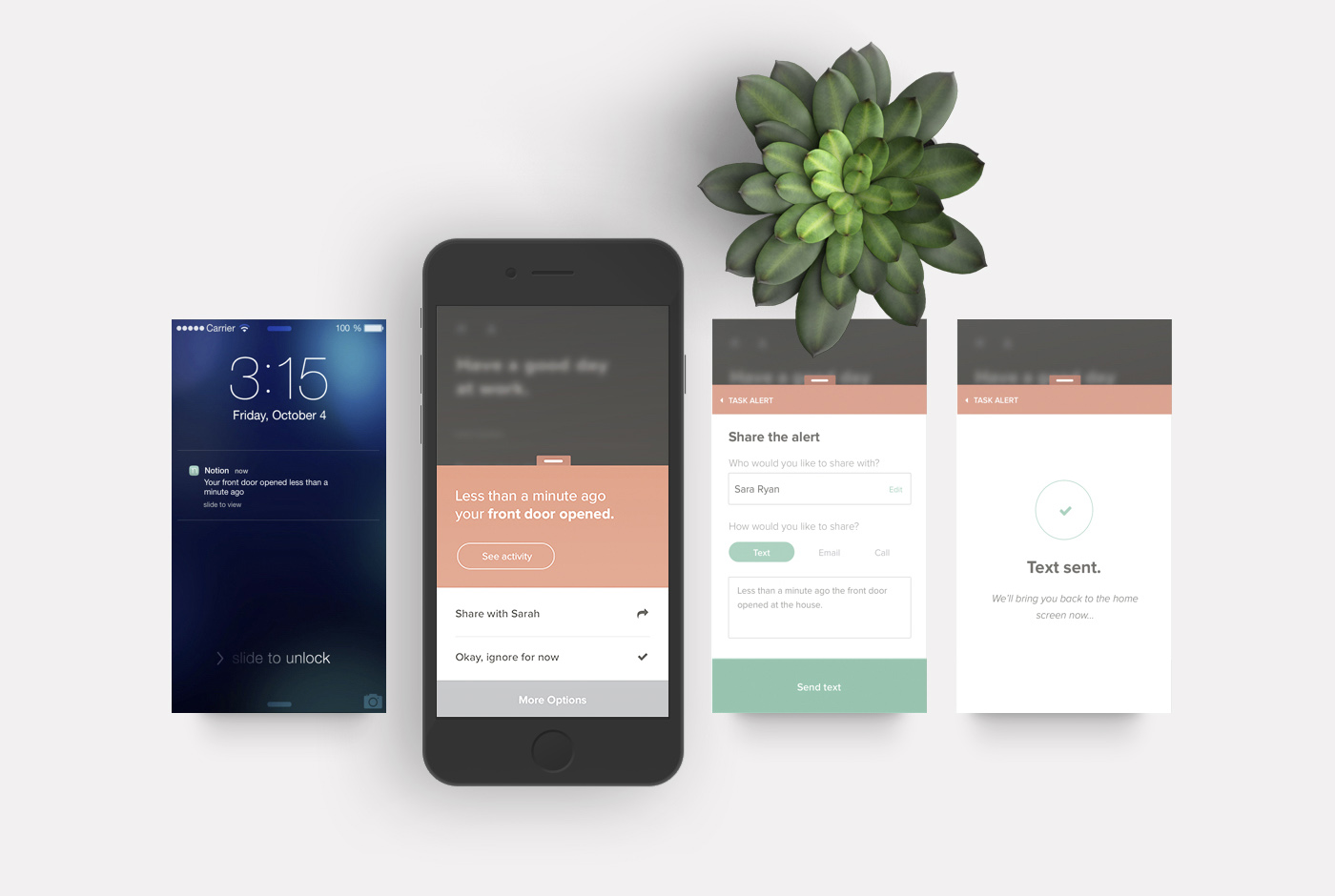
Release Hill #3 - Alerting
A measured response when needed, no alerts when not needed.


—
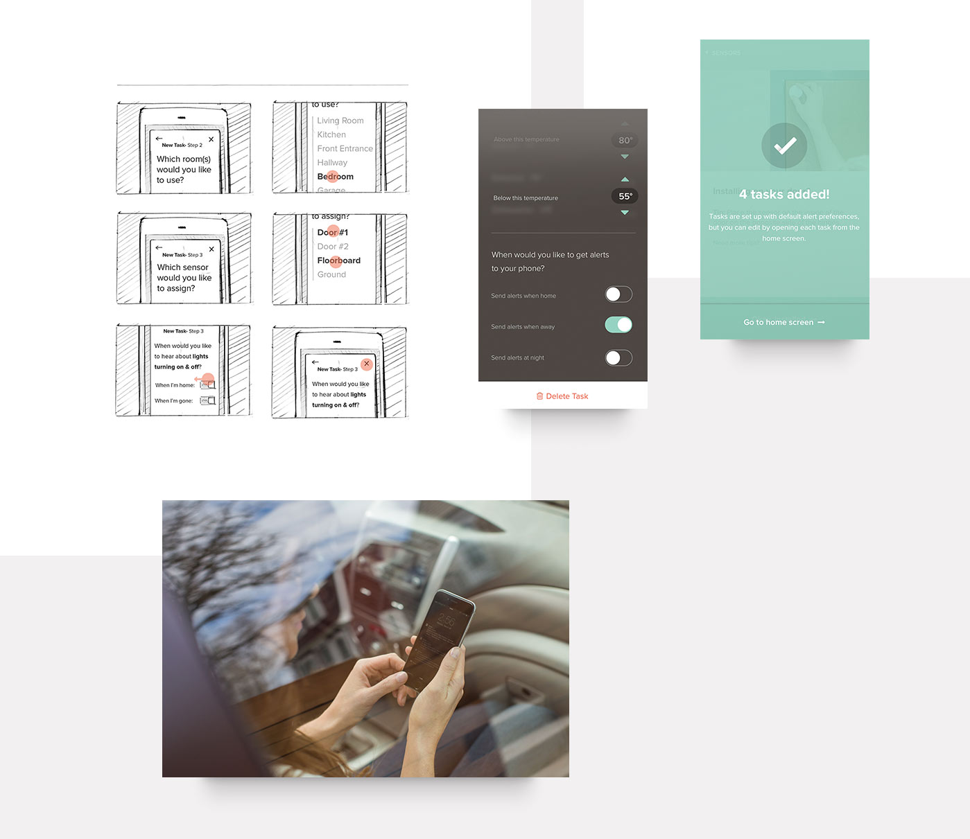
Watch out for alert fatigue
Alert fatigue can happen when there are too many alerts being sent at once. This barrage of alerts makes the user pay less attention.
We brought alert preferences from a device-level down to a single-task level to help manage easier. This made it possible to get alerts at any time for instance, in the case of a water leak, but only as needed for non-emergency alerts, like temperature changes.
